Dark Patterns in Digital Technologies
While waiting for our flight in one of the big US airports, my kids and I decided to grab a bite to eat. When I pulled out my card to pay, I was shocked to discover that the pin pad asked me for a tip – and even suggested the amount. At a fast food joint with no waiter in sight.
I left no tip because I do not like to be manipulated. You probably do not like it either.
Our choices are shaped by our environment, and many are not made consciously. Instead, we simply follow the prompts – taking the course of action suggested to us.
Interface design controls the interaction. We cannot argue with it like we would with a person. We have to either accept or decline the screen’s suggestions. To accept is always easy, but to decline is often hard or impossible – and that’s no accident.
Digital technology is full of dark patterns – manipulative design techniques to trick the user into doing something that benefits the business.
Sometimes by simply…suggesting it.
Forced Tips and Checkout Charity
Forced tips at the checkout are designed to make more money for the business by shaming the customer into compliance. If you hit “No” on the screen, the cashier and everyone behind you gets to see what a stingy bastard you are.
Refuse to feel awkward and guilty. No one cares.
Checkout charity is another technique. Some stores prompt you to round up your purchase to the nearest full dollar amount. When I buy food for my cat at the nearest PetSmart, I am faced with big buttons to donate, and a tiny button to refuse:

I am not saying that we should always be cheap and refuse to tip or donate – only that we should realize that asking for free money violates the implicit contract between customer and merchant. I came here to buy the product, not donate to charity.
By the way, you would not be able to claim checkout donations on your own tax return. You are just helping the MERCHANT save on THEIR taxes.
Maybe, to be truly charitable, we can instead choose our charities independently and donate more than small change.
Confusion by Design
This is an actual SignUp Genius screenshot from my kids’ school. Looks innocent? If only. It’s a minefield:
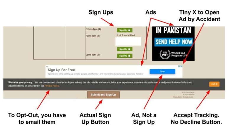
There are 3 different buttons, and only one of them is an actual sign up, easily confused with the other two: a disguised ad and the agreement to share your data for tracking and advertising. Without an option to decline, unless you’d like to email their privacy department and wait for an answer.
The ads here are made to look like content and navigation – you think you click on the next step in the process, but you are clicking on a sneaky ad. Trying to close it with a tiny X in the corner would likely result in clicking on the ad, which would make money for the website – the entire point of intentionally confusing design.
Weaponizing Laziness
My husband shared his recent experience reloading his MetroCard in New York. The machine suggested the amounts in this order: $40-$30-$20. Not the other way around. How many people would mindlessly click and spend more than they need?

Evolution designed us to conserve mental energy. We prefer the path of least resistance – which is a fancy way to say we are lazy. Human brain accounts for only 2% of our body mass, but it consumes 20% of our energy. Do you notice that every time you sit down to study or work, you get hungry? That’s your brain, hungry for energy. With our brain so energy-inefficient, it makes evolutionary sense to save it whenever possible by taking the easy path.
Decision making is tiring – unless we make decisions automatically. We do not want to think, we have better, fun and relaxing things to do. These suggestions on our screens look good enough.
Click “Buy”. Click “Accept”. Click “Agree”.
Call To Action, Bright and Beautiful
We like our digital experiences to be easy. But easy gets unethical when what’s profitable for the platform is not good for us – like accidentally buying something we do not need.
Our attention is captured by what the developer wants us to see. The desired end result is the easiest path through the interface, sometimes the only path.
The most profitable option would be a bright and centrally placed “Call to Action” button that takes the user on to the predetermined outcome. It taps into our cognitive salience bias – the human tendency to pay attention to things that stand out from the environment.

Our evolutionary design makes us want to work as little as possible. This made perfect sense for our prehistoric ancestors who did not know where their next meal was coming from. Today we still like to avoid extra work, and the designers of our technologies are happy to deliver the interface that requires minimal effort on our part.
So we click on the Call to Action and move along the path of least resistance – and away from the alternatives that they do not want us to choose – such as privacy.
The Power of Defaults
Do you ever read Terms and Conditions? How many times have you accepted the “Privacy Policy” without realizing it is really a Surveillance Policy?
Deceptive user interfaces that trick people into handing over their data are not illegal as long as the platform technically complies with necessary legal disclosures – even if such disclosures are hidden and confusing as most “Terms and Conditions” are.
Almost every site you land on would ask you to accept their cookie policy, usually by clicking on a big and prominent button. Cookies are files placed on your device to track your individual browsing history. Cookies enable targeted behavioral advertising across your digital landscape, modifying your behavior with the most “relevant” ads to make you buy, click, view, or vote for whatever the advertiser paid for.
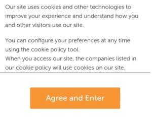
“Personalized ad experience” is a fancy term for algorithmic slavery. An honest question would be: “Would you like us to track everything you do and use it against you?”
Not surprisingly, the option to opt out of cookies is obstructed. If you want to refuse them, you’ll have to search for settings to disable manually. I have not seen a big “Decline All” button yet.
Defaults are not easily undone.
Automatic Opt In - Good Luck Trying to Opt Out
The dark psychology of the interface makes you surrender your data, money, and time, not keep it. The situation would only be remedied if Opt In and Opt Out were made equally easy, but that would be against the interests of the attention economy.
Opt In usually happens by default – but opting out of something you did not ask for requires a time-consuming treasure hunt through the options. To opt out, you have to overcome multiple hurdles that “user experience” designers placed in your way.
Their goal is to keep the settings as they are: profitable for them. The action the platform wants you to pick is set as a default option. The Opt Out process is made as uncomfortable as possible.
Alternatives are tucked away in non-obvious places (bottom menu, small print disclaimers, terms and conditions). Even if you manage to find them, they are hard to decipher. Opt Out is hidden by design.
Here is an example of how time-consuming opting out can be. By default, LinkedIn is collecting and sharing all the data there is to collect and share about us. There is a way to claw back some privacy, but their opt out process consists of a complex menu that is 3 to 4 levels deep. These are intentional “speed bumps” on the way to opting out and you have to click each individual setting:
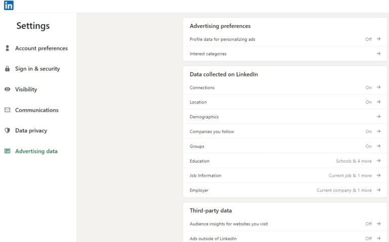
For example, Advertising Data privacy menu takes you to 14 sub-menus, and each of those opens another set of individual settings to undo:
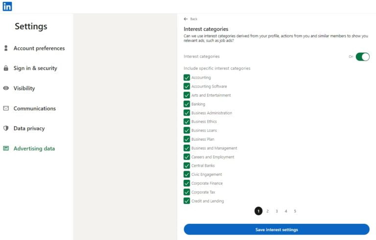
Excessive friction – difficulty – in the choice architecture all but guarantees that the user would not bother changing default settings and would not accomplish their goal – in this case, privacy.
There is interesting research on the difference between Opt In and Opt Out design of choices. In countries where people are automatically considered organ donors unless they opt out, almost everyone is an organ donor – 90%. But if people have to actively choose to opt in to become an organ donor, the numbers plummet to fewer than 15%. The extra work in “opt-in” countries is checking a single box on the form – and most people simply don’t.
This psychology is well known to the “privacy options” designers. Any required disclosures are buried far away from the main interface. Until users are able to actively opt-in for data collection – and are compensated for it accordingly – privacy is non-existent.
Surveillance is the default.
Surveillance by Default
Every social media company would suggest that you “Finish your profile”, that’s more data for sale to advertisers. These reminders would be placed on top of your feed to make sure you can’t miss them, and would pop up again and again. Here are these suggestions from LinkedIn and Facebook:

Sharing data is made easy, but taking it back is much harder – in case of Facebook, it’s not part of a regular interaction with the platform – instead there is a separate (boring) “privacy center”:
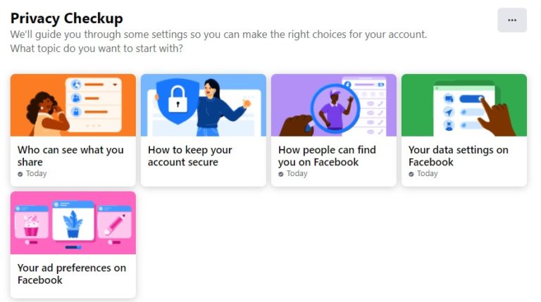
There, we find a multitude of confusing settings, designed to exhaust our miniscule attention span before we even started. The effort to undo all the surveillance options is considerable.
We would just exclaim “Oh, forget about it!” and return to watching our cat videos. Facebook is counting on it.
And that is just one company out of hundreds we are dealing with. Few of us have the time and discipline to dig through the settings of the biggest offenders – Amazon, Facebook, Microsoft, Google, and Apple, and even that is not enough. To minimize the damage, we would have to reject the default suggestions and manually adjust privacy for every single app and gadget – from our smart thermostat to our meditation app.
Who has the time and motivation? We are too busy and distracted.
So the defaults remain, and they are never in our favor.
Engineered Shopping Sprees
When we are shopping on Amazon, we like to think we are making our choices independently, but in reality Amazon makes the choices for us, suggesting what we should buy in multiple ways.
Look, this product is #1 in its category. Here are Related products. People who bought this also bought that. Compare with similar items. Recommended for you. You might also like this. And on and on.
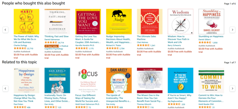
Even if the products they recommend are not “sponsored listings” (ads), what is algorithmically presented to you is what you are most likely to buy. Either way, Amazon makes money. Cheaper alternatives from smaller sellers would not make it to the list of “suggestions”. Amazon makes sellers pay a $40 monthly fee just for the privilege of having a “Buy Now” button. Those who are not a “professional seller”, don’t get one.
Big shopping sites would always suggest advertised products first. Sellers pay Amazon for the eyeballs of the customer in the placement of “Sponsored” listings, and Google would put advertised products on top of your search results. There might be better and cheaper alternatives that would satisfy your needs – but they are hidden.
Priming the User
Netflix nudges us into “Most Liked” and “#1 in Movies Today”, as a result, most of what we watch comes from their recommendation engine. Here are the “Popular on Netflix” snapshots from 2 different profiles in my family:

Notice – they are completely different. So the “most popular” options really are just those we are likely to click on, based on the extensive data the platform has extracted from us. Other customers might despise these “popular” movies.
Netflix knows they have a higher chance to keep me on the screen with a romantic flick, and my husband with a war movie.
Highlighting movies or products this way uses the psychological effect called Priming – the user is conditioned by visual cues on the screen to view the preferred option as their best choice.
Social Proof: Everyone is Doing It!
Priming is supercharged if the platform can convince you that your friends already chose the preferred product, service, or action. A questionable experiment was run by Facebook on 61 million voters – without their consent – by showing people pictures of their friends who already voted, influencing real life voter behavior and the results of the elections. One can argue that such an experiment promotes the greater good, but the same tactics are used to manipulate users for less noble ends.
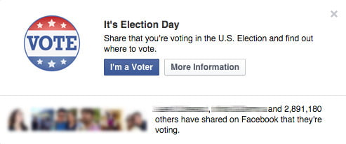
The platform would show you the preferred option in a happy “lifestyle” setting to prime you to buy: associating the product with positive emotions is a hallmark of advertising. Social proof is in the images of happy and successful others who already made the choice, especially if it’s people you know from your social network.
Look, these LinkedIn connections attend the event – you should too. Look – these Facebook friends follow this page – you should too:
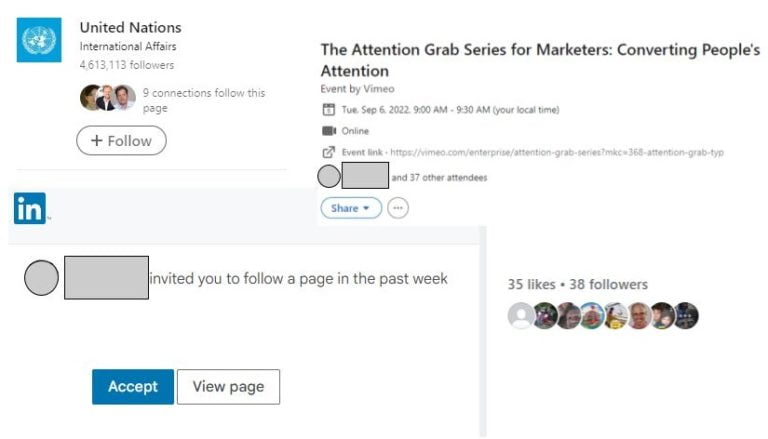
And on and on, social proof, algorithmically hijacked.
Suggested with Authority
The power of social proof can be further enhanced by our human bias for authority – we trust suggestions from the figures we respect. These can be our friends, or the online platform itself – we trust Amazon to recommend the best choices for us, and Google to have the best answer to our search.
When Amazon slaps a “Preferred by Amazon”, or “#1 in the Category”, or “Bestseller” label on a product, you are likely to pick the option preferred by the platform – they have all the data, so it must be the best.
The platform can enlist the help of experts – real or imaginary. Book reviews from famous authors would sell the book. Endorsements from actors in white coats who look like doctors would sell a drug.
Usually, there is nothing wrong with trusting the authority of an organization or a person, but like Ronald Reagan said about the Soviet Union: “Trust, But Verify”.
Whose Choice Is It Really?
We are used to thinking that more choice is a good thing, but according to Barry Schwartz, the author of a bestselling book The Paradox of Choice, more choice leads to decision-making paralysis. Excessive choice stresses us out – the more options we have to choose from, the more cognitive power we use up, unsure which one is the best.
Fewer options are better. Amazon uses its recommendation algorithm to suggest a manageable number of comparable items under “People who bought this item also bought” or “Related Items”.
They provide us with comparisons that expedite our decision. These lists of product recommendations tap into a contrast effect to speed up the purchase: just place the item next to more expensive alternatives, or products with lower review rating, and the choice becomes obvious.
Researchers in the past experimented with the psychology of selling wine – if you place a bottle you want to sell between cheap and expensive, customers would pick it as the best value. An overpriced alternative becomes an anchor, a comparison point, we buy a cheaper bottle and walk away satisfied that we got a great deal.
Once we start thinking about too many options, decision fatigue sets in. The danger for the interface designer is that we give up, fail to choose anything and abandon the process.
So they label the choice “Most liked!” or “Best Value!”
And we click “Buy Now” as they knew we would.
Captive Audience
Have you ever bought an airline ticket from a discount airline like RyanAir or Spirit? Then you had endured their cross-selling extravaganza while they had you as their captive audience. I just want the ticket, you moan through the tedious purchase, but every step on the way to checkout they suggest you buy luggage allowance, travel insurance, car rental, hotels, parking, and the right to choose your own seat!
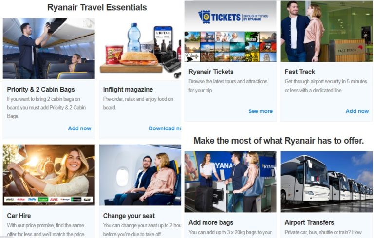
They know they have you trapped inside the process, and they would milk you for all you’ve got.
While they have our attention, these airlines cross sell – and so does everyone else. I reply to birthday invites on Evite.com, and I am bombarded with “Special offers to take advantage of”. I order a photobook on Shutterfly, and my screen is instantly crowded with dozens of other photo products to buy – featuring pictures of my kids to push my emotional buttons!
So it is a fact of our digital life – once you find yourself a captive inside a sales channel, the stream of “helpful suggestions” to squeeze more money out of you never ends.
Sneaky Ad-Ons
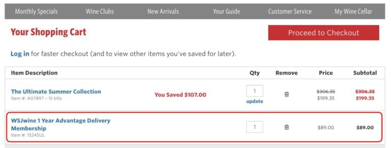
Our inertia leads us to accept default options hidden in plain sight, made intentionally easy to overlook – like a tiny pre-checked subscription box. User experience makes it easy to skip them, as we mindlessly click “Next” through the smooth purchase experience. We cannot be bothered, but later on we pay for our inattention when we discover unwanted charges.

Automatic Sign-Up
Every time I use an online service like Homeadvisor to find a handyman, I am automatically enrolled in their multiple mailing lists that clog my inbox.
Most of us go through the process of account registration or product check-out on auto pilot – we see them as standard operating procedures that require minimal cognitive effort. But within the main process the developer can hide superfluous default options to get more of your data and money that have nothing to do with the original purpose of the transaction.
Do you want to sign up for our marketing emails? The box is already checked while your attention is engaged elsewhere.
We click through the process unaware that every nice green “Next” button can lead us somewhere we had no intentions to go. We end up automatically signed up for something we do not need.
The path of least resistance laid out for us by web designers satisfied our desire to get the product or service with the least amount of work, and now our email is in their system. They know our human nature – it is unlikely that we make an effort to unsubscribe.
When the Stakes are High
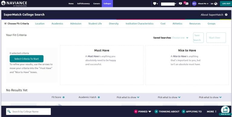
Each high school student is a potential $70K a year cash cow that colleges want to lure to their pasture, competing against each other. What if some college recommendations turn out to be ads in disguise? Hey, teenager, this school is a great fit for you – but there is no way to know if they paid for the privilege of being on the list.
My son’s high school guidance counselors, like most schools in the US, rely on college recommendations from Naviance, owned by PowerSchool – who also manage students’ academic data. The software builds a comprehensive psychological profile of each student, so at the end of the day, they know them better than students know themselves. Colleges are eager to gain access to this data.
How college recommendations are prioritized is an algorithmic black box. For all we know, they could be just like Google or Amazon sponsored listings. But unlike a simple purchase, a human future hangs in the balance. The student could make a college decision that defines their entire life based on the ranking of top suggestions – after all, which one of us ever goes beyond the first page of Google?
The decision of whether a recommendation would be genuine or sponsored rests with the executives of the company. They would have to choose between their integrity that no one would notice, and the bottom line that directly affects their bonuses and job security.
Parents, be vigilant – the temptation to make a “helpful suggestion” via a trusted guidance counselor who relies on technology cannot be underestimated. The conflict of interest is clearly there.
When They Give You No Choice
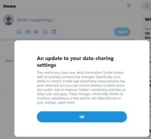
Twitter recently informed me that “The control you have over what information Twitter shares with its business partners has changed. Your ability to control mobile app advertising measurements has been removed”. Ok?
No, not ok – but they gave me no other options short of not using them at all. It’s a false dichotomy: there is no real choice.
Negative Options: Click to Not Sign Up
“Check the box if you do NOT want us to send you marketing messages”.

Wait, what?! You have to click to NOT SIGN UP if you don’t want them to spam you, otherwise they assume you are ok with it. So OFF is really ON!
It would take a considerable mental effort to discern such “double negatives”, and it’s easy to make a mistake – in their favor.
How to Resist Dark Patterns of Suggestion
Suggestions show up all over the web, nudging us to subscribe, add items to shopping carts, or sign up for services.
Every interface is designed for the benefit of the platform. We need to be skeptical about its intentions and analyze it on the spot to answer the question – is the suggestion on the screen aligned with our best interests, or are we better off without it? Are we being subtly manipulated to give more than is strictly necessary for the purpose of this transaction?
We are rarely rewarded with something of real value for saying yes to the suggestion. There is no give and take in extraction of our data. This is unethical and we need to defend ourselves.
The strategy to deal with manipulative suggestions is to Think Before you Click:

Think Before you Click
User interface designers count on our evolutionary biology to skip the pause and proceed from impulse to response immediately. Mindless clicking is easy – and profitable.
Simple awareness is enough to resist dark patterns. This requires keeping our rational mind switched on at all times, instead of relying on automatic reactions of our emotional limbic brain. When we know what manipulation looks like, and are on a lookout for it, we regain control of our user experience.
We have to look into the potential consequences of blindly following the interface:
- Did I just overpay for the product?
- Did I subscribe for something I do not need but would be charged for later?
- Did I surrender my personal information that would be used to sell me more stuff?
- Will my data be sold to third parties to manipulate me in unknown ways?
- Will my mailbox be filled with spam because they took my email?
This type of vigilance can seem tiring at first, but it only needs to be applied to new online situations. Once you analyze a platform and identify the pitfalls to avoid, you can switch back to autopilot. Unless they change the design, then you have to evaluate them again.
To resist manipulative suggestions, we have to interrupt the pattern of least resistance. To do the extra work they do not want us to do:
Suggestion: “Agree to Terms and Conditions”.
Resistance: Can I opt out, even if it takes a few more clicks? Email their privacy department to reclaim your digital freedom.
Suggestion: “Accept all cookies”.
Resistance: Adjust cookie settings to only “Strictly necessary”. Regularly clear cookies from web browsers on all devices.
Suggestion: click on Call to Action in my email that takes me to their website to increase their traffic.
Resistance: Is it in my interest to be sucked into the rabbit hole of content I would find there?
Suggestion: Watch a “Recommended” movie or video.
Resistance: Make your choice manually.
Suggestion: click Buy Now.
Resistance: Did I do my comparison shopping to make sure no better option is available elsewhere?
Suggestion: a Pop-Up message to Subscribe.
Resistance: Would I receive useful information or simply ads? Would they share my email?
Suggestion: Pre-checked box in a checkout process.
Resistance: Scan the page for inconspicuous options they don’t want you to see.
For the majority of platforms, dark patterns are unavoidable. The strategy to deal with them is to proceed to your goal without giving up any more of your data or money than absolutely necessary. Do not feel guilty saying no to manipulative tactics. Only do what is aligned with your values.
Your awareness of manipulation absolves you of the need to comply.


